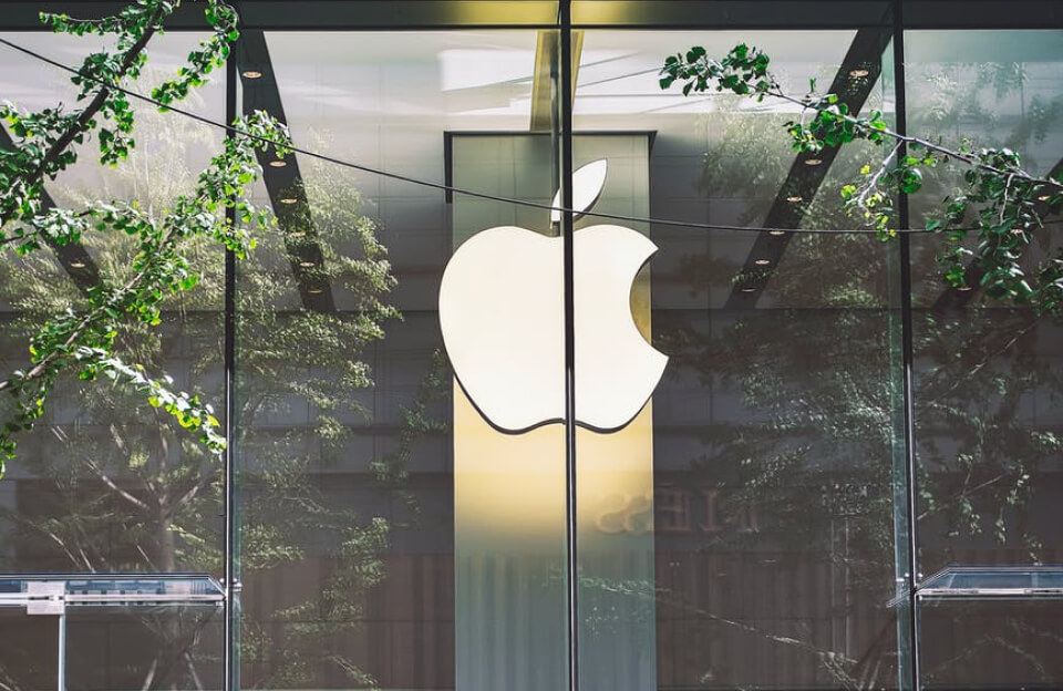
Logos. They’re not just tiny images at the corner of a website or the top of a product label—they’re the face of your brand. Think about it: the best logos out there are often the simplest. Apple’s bitten apple, Nike’s swoosh—simple, yet they speak volumes. That’s the magic we’re aiming for. In this guide, we’re all about embracing simplicity to craft a logo that stands out and deeply resonates with your audience.
Let’s dive into why cutting down on the complexity can make your brand stick in the minds of your customers.
Understanding Your Audience
Before you start sketching designs, you’ve got to know who you’re designing for. Who are your people? What do they like? What do they value? Figuring this out is key to a logo that clicks with those who see it. Start by mapping out your target audience—age groups, preferences, lifestyle choices, and jazz. How? Well, roll up your sleeves because it’s time for a bit of detective work. Surveys, social media polls, and good old market research—tools like Logoswell can help you dive into these waters. By getting a clear picture of your audience, you’ll be better equipped to design a logo like a friendly nod across the room, saying, “Hey, I get you.”
Key Elements of Logo Design
Color and Typography
Colors aren’t just pretty to look at—they tell stories, evoke emotions, and connect with us on a deep level. The same goes for typography. Consider what your brand stands for when picking these elements for your logo. Are you all about excitement and energy? Bright, bold colors might be your jam. Or perhaps you’re more about trust and dependability? Then, softer shades and strong, stable fonts can speak volumes. If you’re ready to start designing, use to create your online logo design with Adobe Express, which can help you match your brand’s personality with the right color and font choices, ensuring that your logo doesn’t just look good—it feels right.

Also, according to insights from Social Media Magazine, people form a view about a product within 90 seconds, and much of that judgment is based on color alone—so you know you’ve got to get this right!
Psychology of Simplicity
Ever wondered why the simplest logos often stick in your mind the longest? It’s all down to how our brains work. Complex designs can be visually stunning but tend to make our brains work harder to process the information. Simple logos make it easy. They’re like quick, sharp handshakes, making a strong, swift impression. Social Media Magazine highlights that our cognitive processing favors logos that are easily recognizable and remembered, enhancing brand recall significantly. This psychological edge is why embracing simplicity could be your smartest design move.
Versatility and Adaptability
Imagine creating a stunning logo that looks fabulous on a billboard but turns into a blob on a smartphone screen. Not so great, right? That’s where versatility comes in. Your logo must work everywhere—from a giant billboard to a tiny app icon. Introducing the concept of a logo family can be beneficial here. Think of it as your logo’s extended relatives—different versions that ensure it looks its best on various platforms. According to the Marcom Foundation, having a versatile logo family ensures brand consistency across all user touchpoints, which is crucial for building trust and recognition.
Conceptual Depth and Audience Engagement
Diving deeper into what makes a logo truly resonate, it’s all about the symbolism and the stories embedded within it. A logo should be more than just an attractive graphic; it should be a snapshot of your brand’s ethos and narrative. For instance, think about how the Apple logo isn’t just an apple; it represents knowledge, curiosity, and innovation. This meaningful symbolism connects emotionally with those who share or aspire to those values.

Strong conceptual foundations do more than look good—they feel significant. According to the Marcom Foundation, logos incorporating these deeper meanings tend to forge stronger connections with the audience, turning casual viewers into loyal customers. It’s about crafting an image that people can believe in and stand behind, which promises continuity between what the logo represents and what the brand delivers.
Testing and Refining the Logo
Before you finalize your logo, putting it through its paces is crucial. How does it fare in the real world? This is where A/B testing and focus groups come into play. Show your logo options to a group from your target audience and get their raw, honest feedback. Which one resonates more? Why? Use their insights to tweak and refine. It’s about evolving your design based on real reactions, ensuring that when your logo finally hits the market, it’s not just good—it’s perfect.
Conclusion
Creating a logo that truly resonates with your audience is more than just a design task; it bridges deeper engagement. Remember, the keys to a successful logo are:
- Simplicity.
- A solid understanding of your audience.
- The ability to adapt across various platforms.
Keep these principles in mind, and you’ll craft a logo that looks great and embodies the essence of your brand.